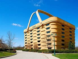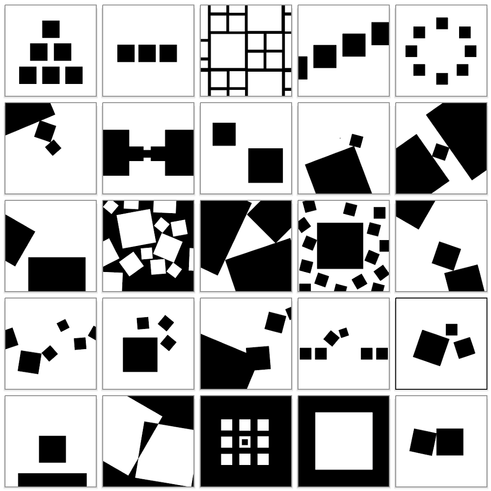
From the earliest cave painters to Matisse and beyond, almost every painter creates a composition. Composition in architecture and painting is simply the arrangement of the creative work’s elements in the given space. This matters because, in painting for example, the canvas presents a flat surface and the painter doesn’t want the viewer’s eye to stop and stay in just one place or, worse, to look away. There are many different techniques that artists use to create visual interest in their work and help the eye move around the surface. Lines, shapes, colors, textures, light and dark; placement of forms; and manipulation of space around them all can all help achieve the desired effect. Pick almost any painting from any era and you will see this illustrated. What people find most appealing tend to be paintings where there is not just one focal point, but rather the eye moves on to another and another. There’s a lot to absorb, to experience.
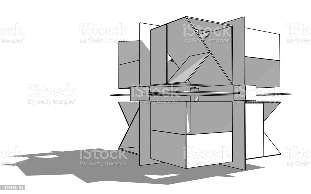
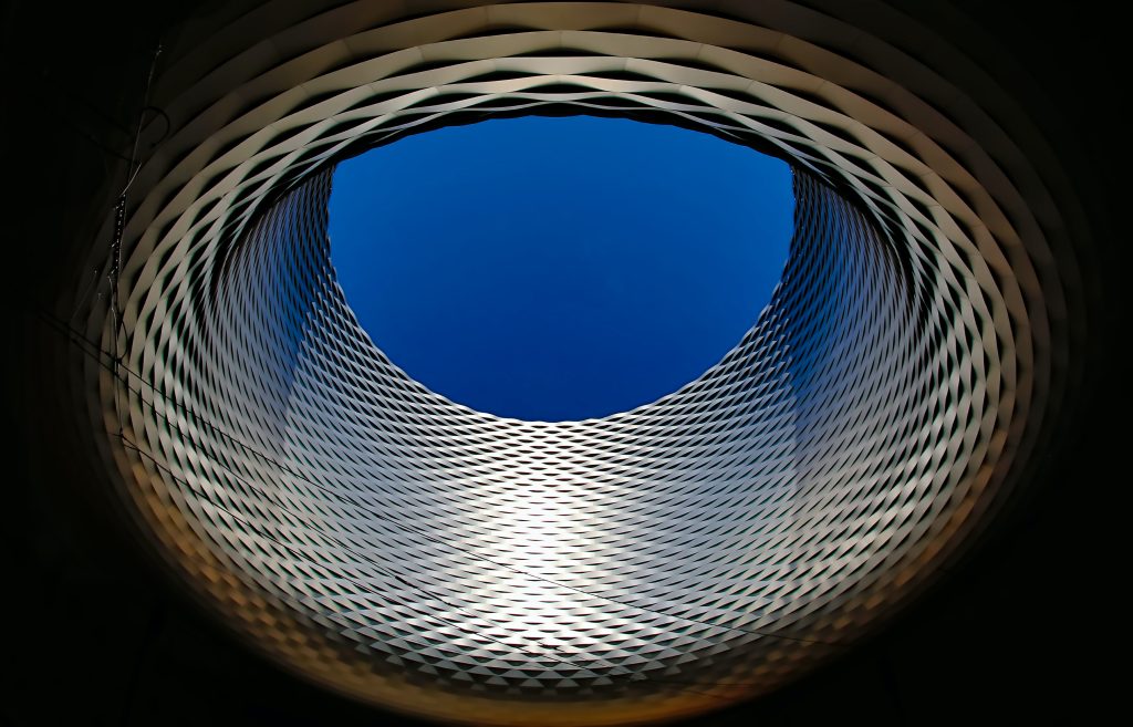
CAMOUFLAGE : The way a building integrates with its enviroment , that is called “mimesis”.
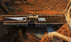
ORGANICISM : Harmony between human beings and nature .
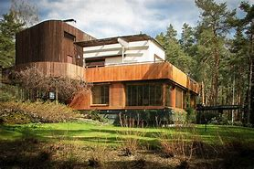
CONTEXTUALISM : It is designed taking into account the characteristics of the environment around it .
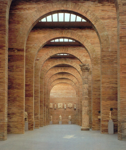
CLASSIC SPACE : is closed and compact, centralized, with at least one axis of symmetry
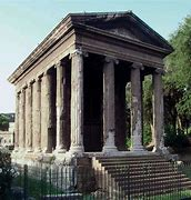
SPACE WITHOUT CENTRE : It is organized into two spaces: dominant central and secondary spaces around it. This is a concentrated and stable arrangement. The central space is usually regular in shape and large enough to gather smaller spaces around its perimeter.
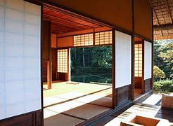
CONTEMPORARY SPACE : Create large, bright and airy open spaces, not closed rooms anymore. And use a simple material palette
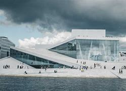
RHYTHM : The repetition of elements, at least three times, that establish a recognizable “pattern”.
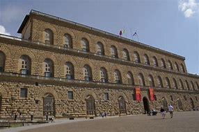
AXIS : is an imaginary line that organizes a group of elements
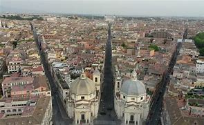
SYMMETRY : Through an axis, the elements that compose it reflect each other
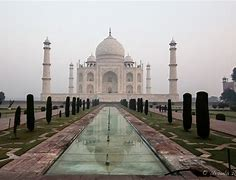
HIERARCHY : A system that organizes the space according to how important they are using different shapes, sizes, colors, location…
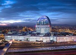
MOVEMENT : The irregularity of forms and the variants of order inspire the idea of movement, of displacement.
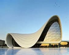
UNITY : The way the relationship between the parts to the whole makes you think that nothing should be removed or added.
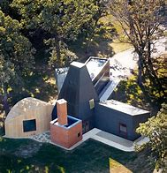
LIMITS : It is where the elements change from the rest .
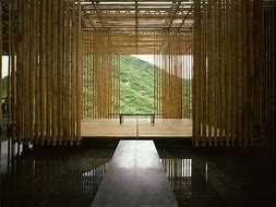
LIGHT : It helps set the mood for the space and determine how those functions are distributed.
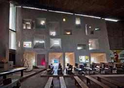
CONTRAST : Contraposition of elements on the basis of volume, colour, shape, texture, size, disposition..
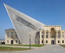
COLOUR : It can show volume and detail, visually imitate aspects of space, provide emotions…
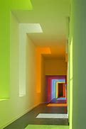
TEXTURE : to produce different sensations .
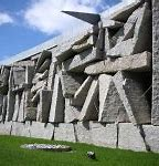
MECHANICAL FUNCTIONALISM : the form is linked to the functions it is used.
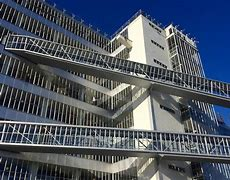
MORALISTIC FUNCTIONALISM : is the expression of its purpose and of its time.
The materials are used with integrity and express themselves .
